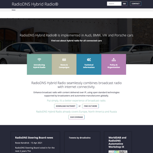
RadioDNS was in dire need of a makeover, they needed to jazz up their brand and website to stay relevant in the audio and automotive industries.
What was the issue?
❌ Key pages were hidden and tricky to find
❌ The three key journeys for broadcasters, developers and manufacturers went round in circles without giving them a next step
❌ The branding; colours, imagery and fonts felt outdated for a modern organisation
❌ Too much text made for long reads on key pages
❌ The colours of the links and buttons weren’t accessible for users, potentially stopping them accessing content and reducing conversions for membership
❌ The navigation wasn’t organised
❌ The page layouts were cluttered and confusing
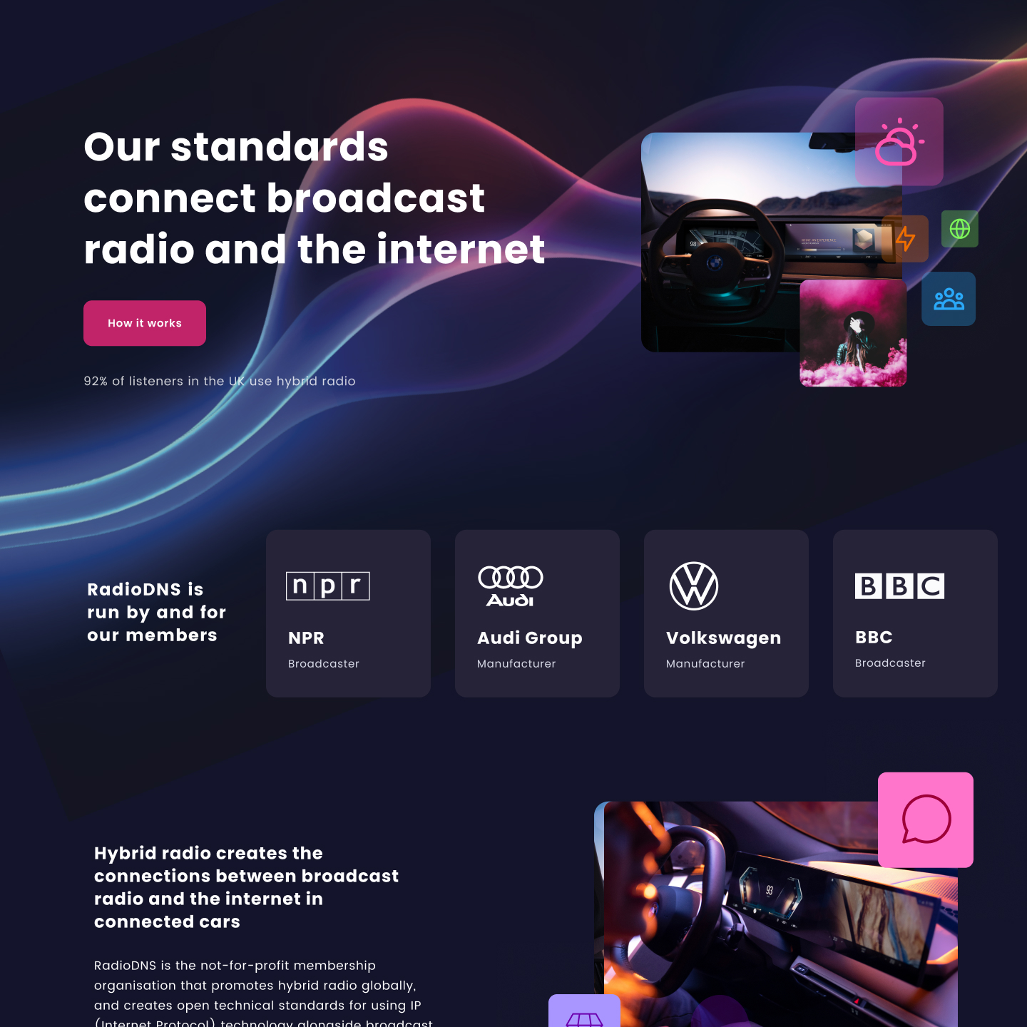
How did we fix it?
👉 Our clear navigation hierarchy simplifies the user's search for relevant information in their journey.
🛎️ Our dynamic CMS and modular system makes it easy to create pages and tag items, allowing users to quickly find the information they need.
💁♂️ We displayed the main user journeys prominently on the homepage and in the navigation.
👩🎨 We improved branding by adding a dark scheme with vibrant colors to highlight important elements like links, buttons, and typography.
🚘 Lastly, we ensured that while our brand stands out distinctly, it still resonates with its audio and automotive roots.
What we did
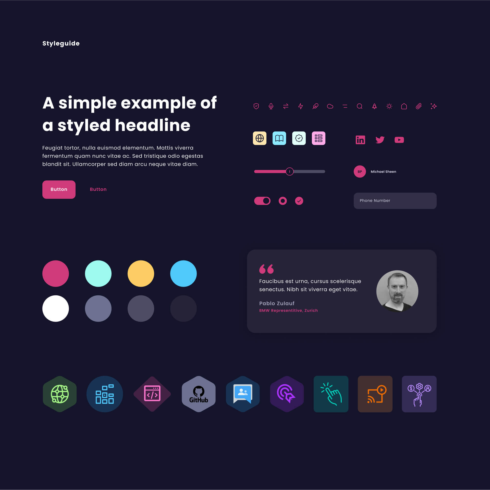
Digital & print Guidelines
Robust Design System
Responsive Web Design
Sexy Printed Assets
Digital & Print Guidelines
Beauty Unleashed: Where pixels meet print
Through some initial moodboards made of colour, typography and essential elements like buttons, we were all drawn towards a dark mode reflecting the development sphere and the bright flashes of colour to sign post our users to useful content.
They branding had to:
✅ Sit comfortably within the automative and radio industry
✅ Look like it belongs in the future
✅ Stand out from the crowd
✅ Be simple to understand
✅ Work across print and digtal assets
"We got in contact with Eloïse at the beginning of our project to redesign both our brand appearance and our online resources.
We really appreciated her engagement with our thinking, her exploration of the visual elements, and creating the manifestations of our new brand - physical and online."
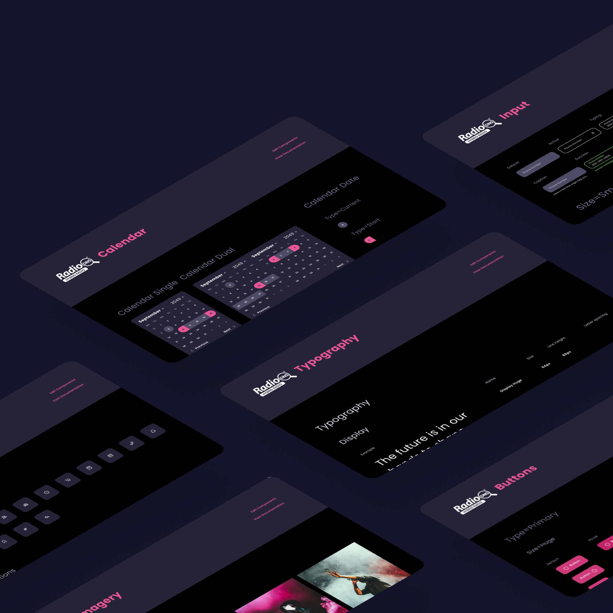
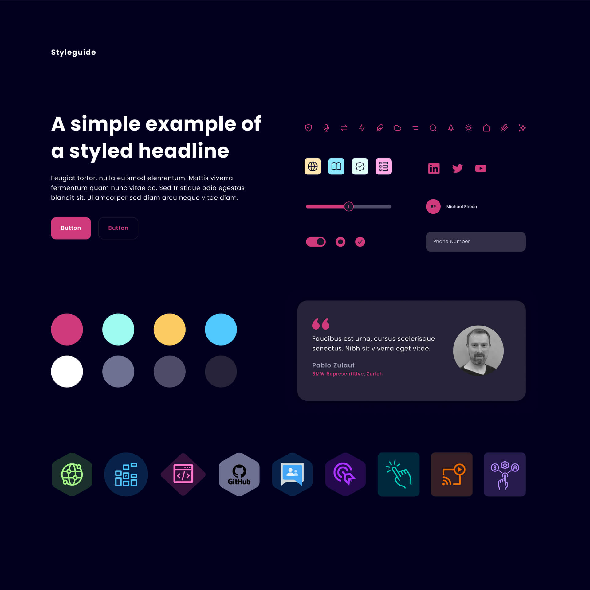
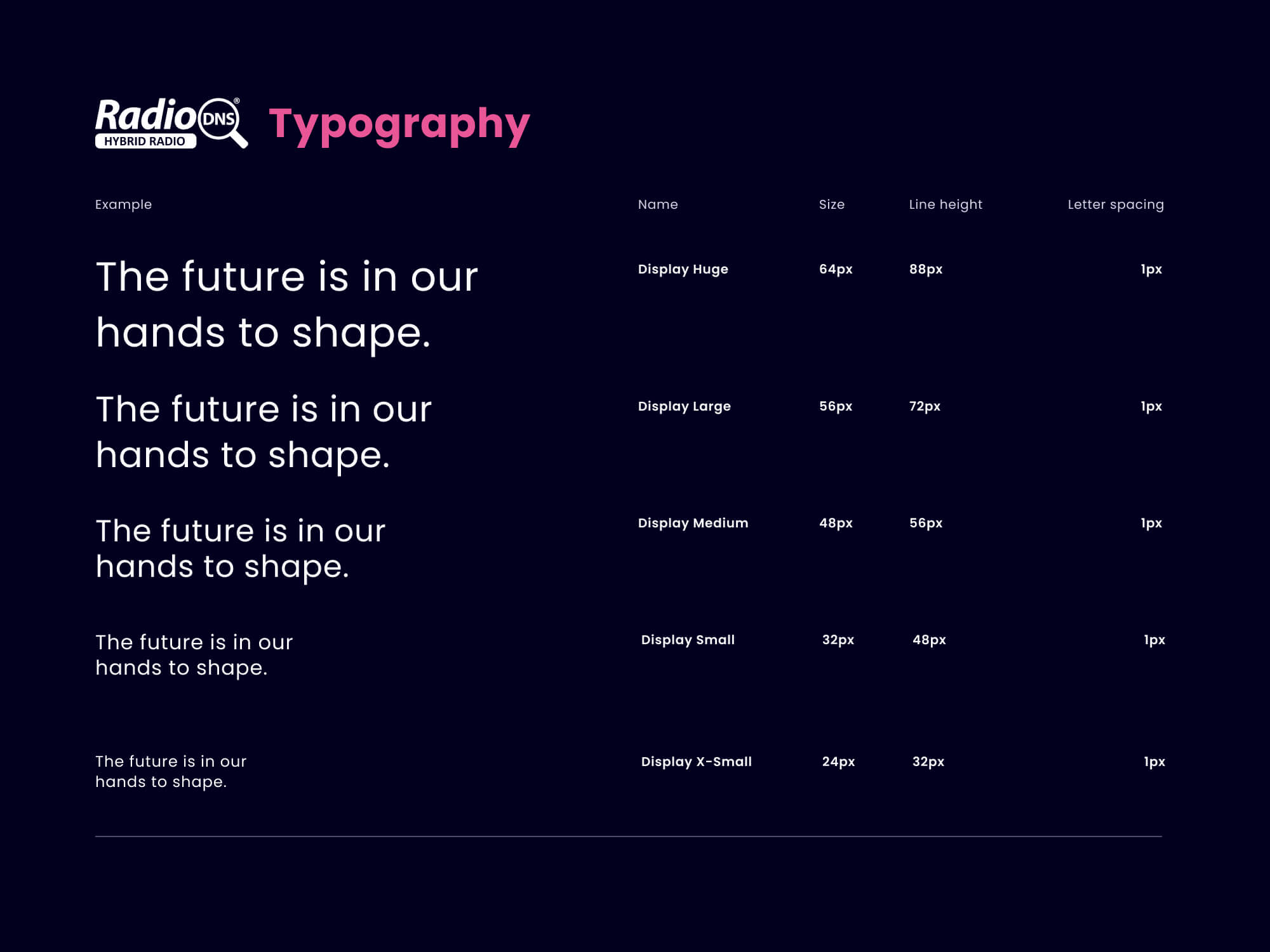
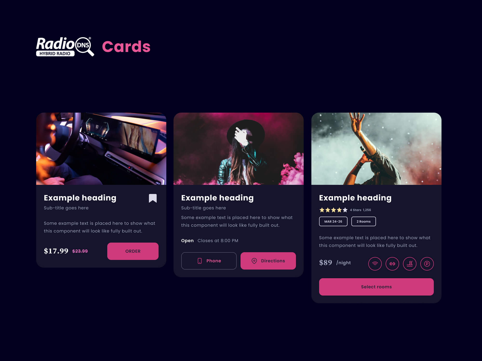
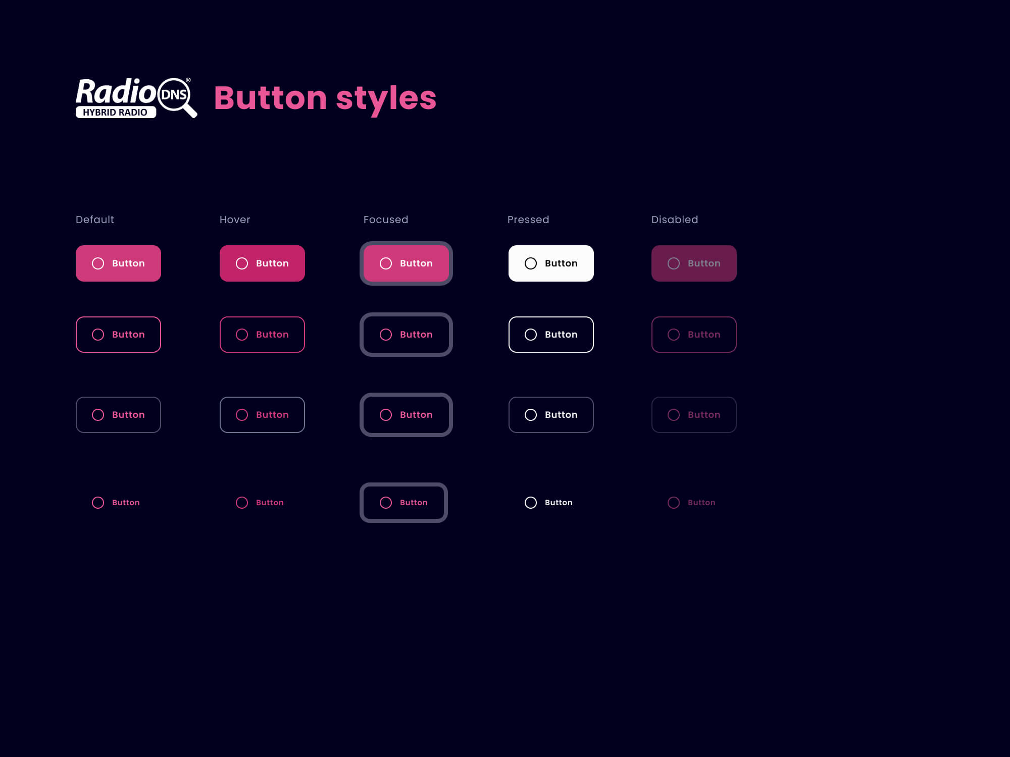
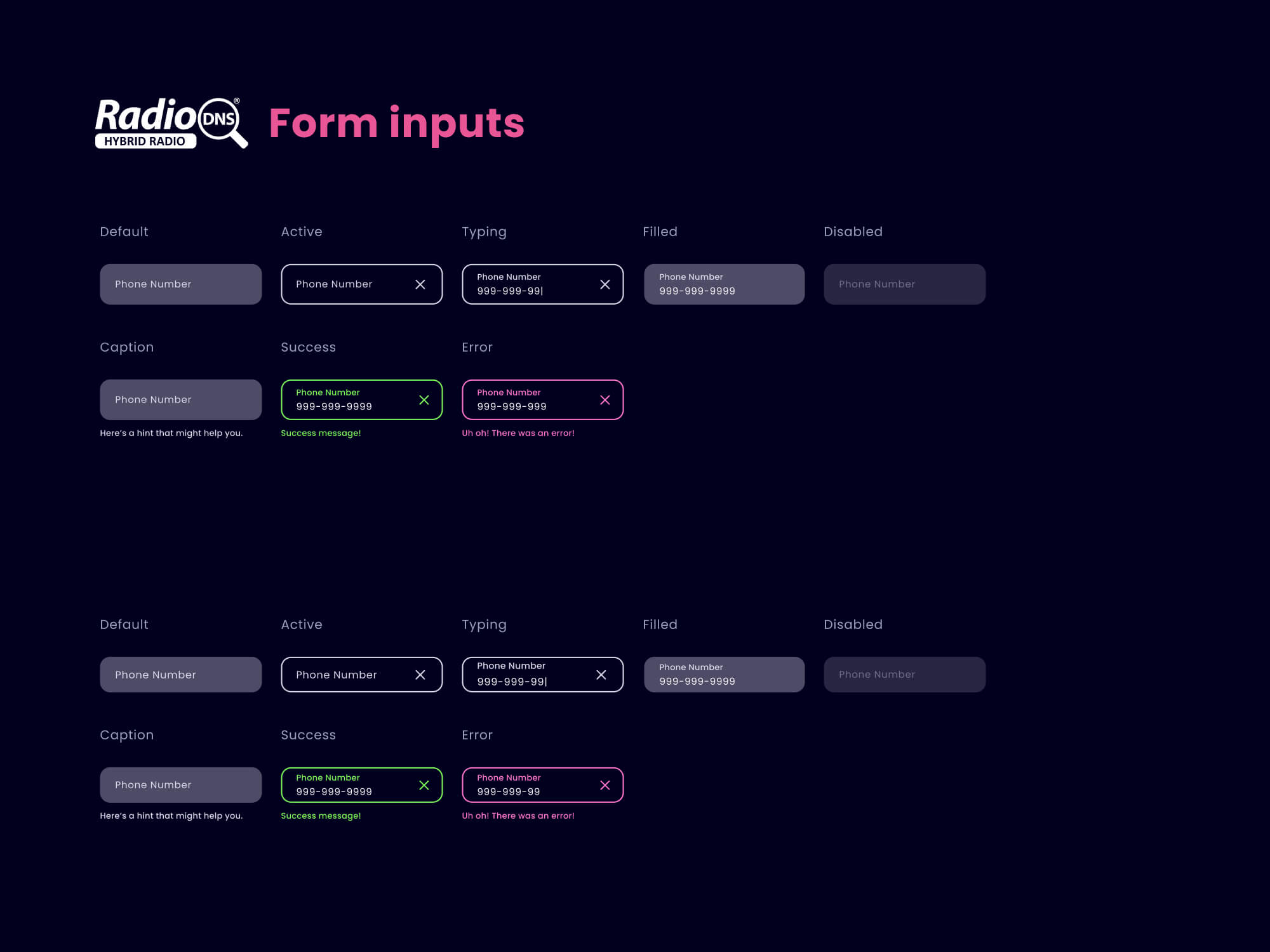
Robust Design System
A cohesive design system was key to crafting an eye-catching visual identity that resonates with the brand's values, and makes coding feel like a walk in the park
Crafted with the precision of a diamond cutter, the design system is the holy grail for developers and designers alike. It's the secret weapon for creating pixel-perfect pages or features - it's like playing with Lego blocks, but for grown-ups.
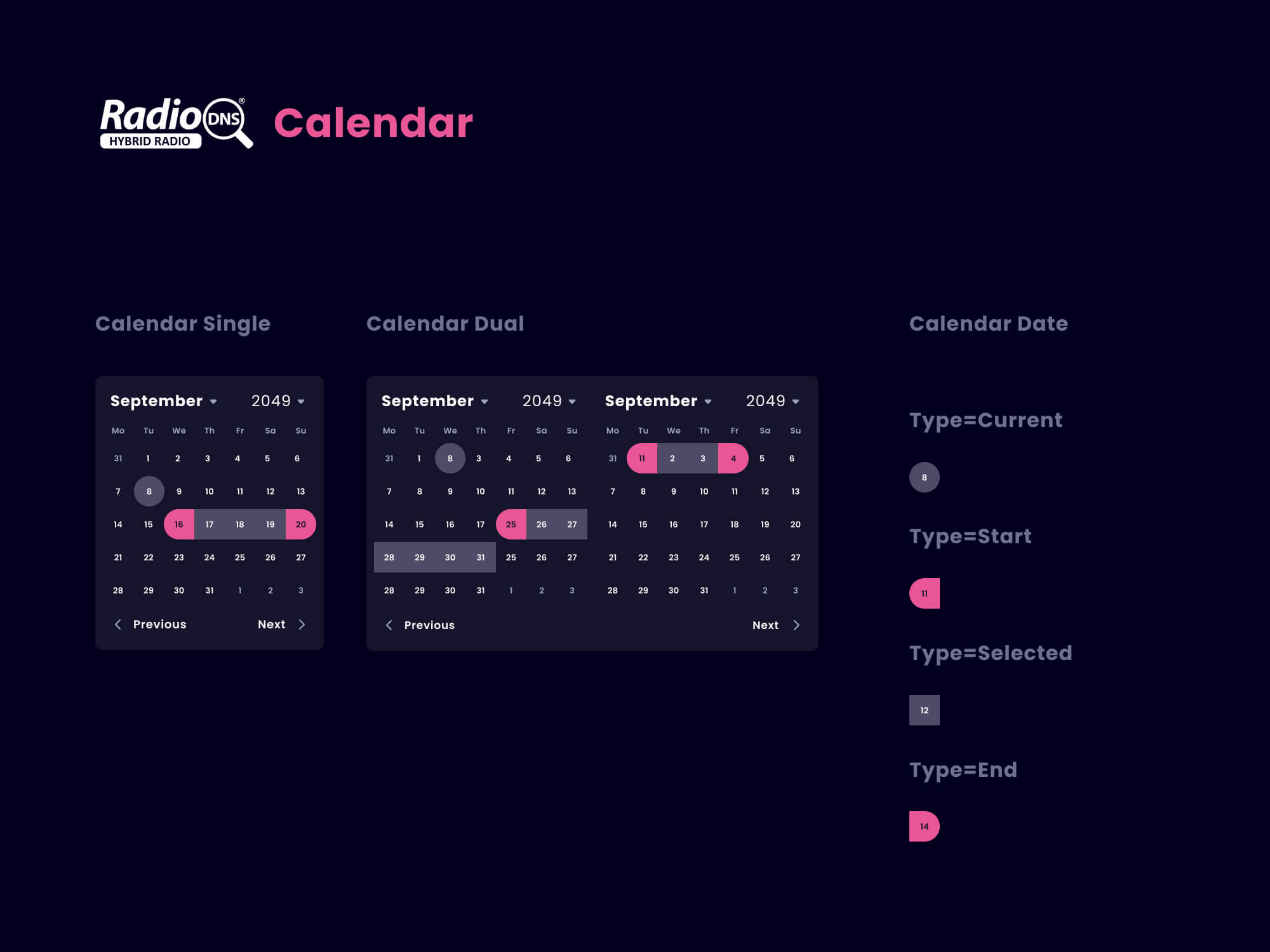
We delivered a
✅ Colour system
✅ Shadows and animations
✅ Forms, the boring stuff that requires thought!
✅ Buttons, check boxes, tables and toggles
✅ Modular blocks (called cards) for events, blog posts, features and technical posts
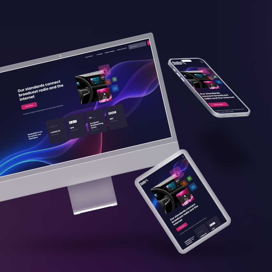
Responsive Web Design
A sleek and speedy website that functions seamlessly on all devices
Websites are like first dates, and RadioDNS's was showing up in a scrappy t-shirt. It wasn't strutting its stuff - the resources, information, events and industry news that so many folks depend on was hidden and confusing.
With some rethinking we:
✅ Encouraged trust by showing high profile member logos like Volkswagen and BBC
✅ Developed custom pages for guides and support to help users navigate to the good stuff
✅ Elevated the events section with key info and images
✅ Cemented the brand with gorgeous pops of colour, imagery and iconography
✅ Reduced the number of forum questions by introducing a handy FAQ section
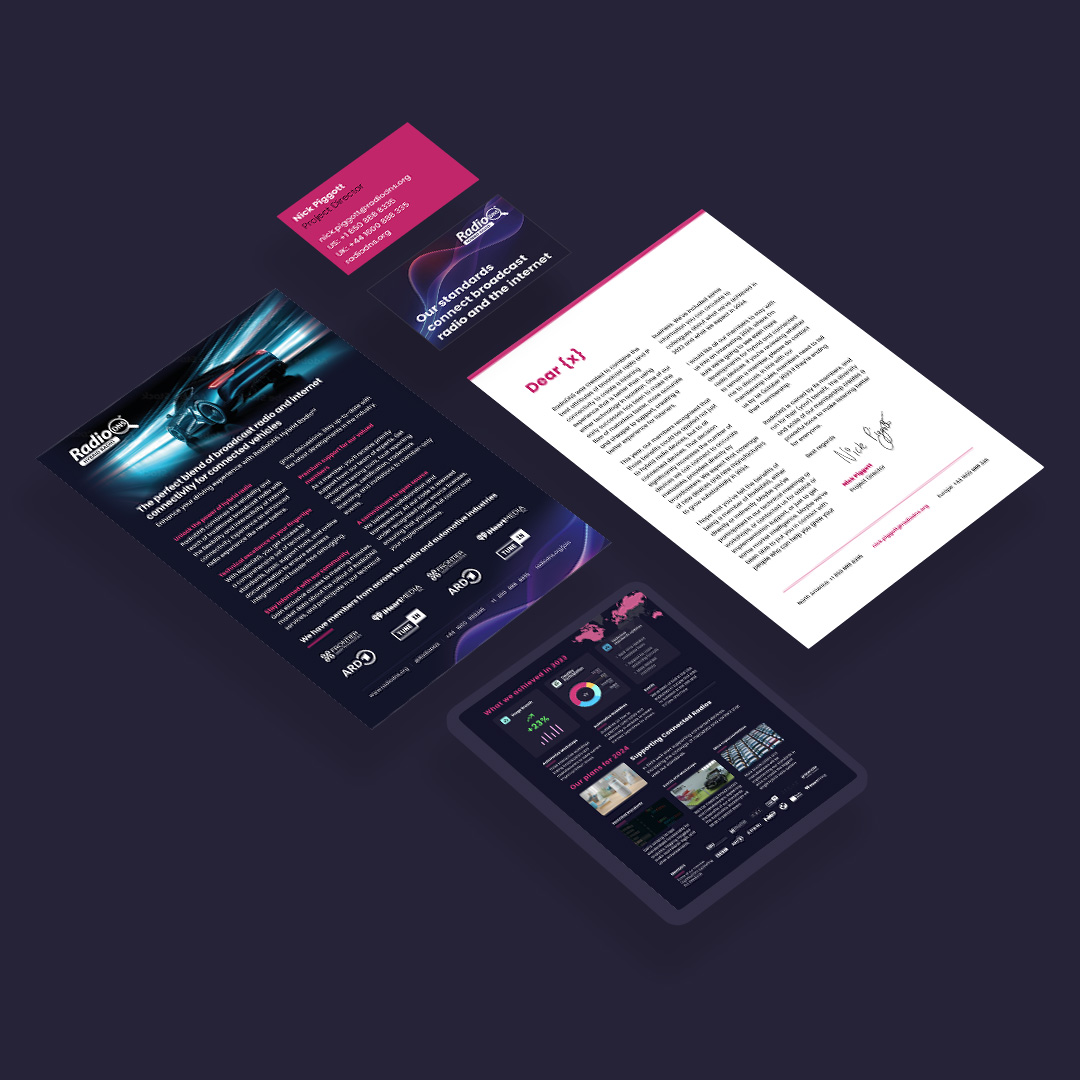
Sexy Print Assets
Taking the online offline
RadioDNS is an international organisation and this takes them all over the world networking and speaking at industry events. We needed their print assets to inform potential members and advocates of their incredible work.
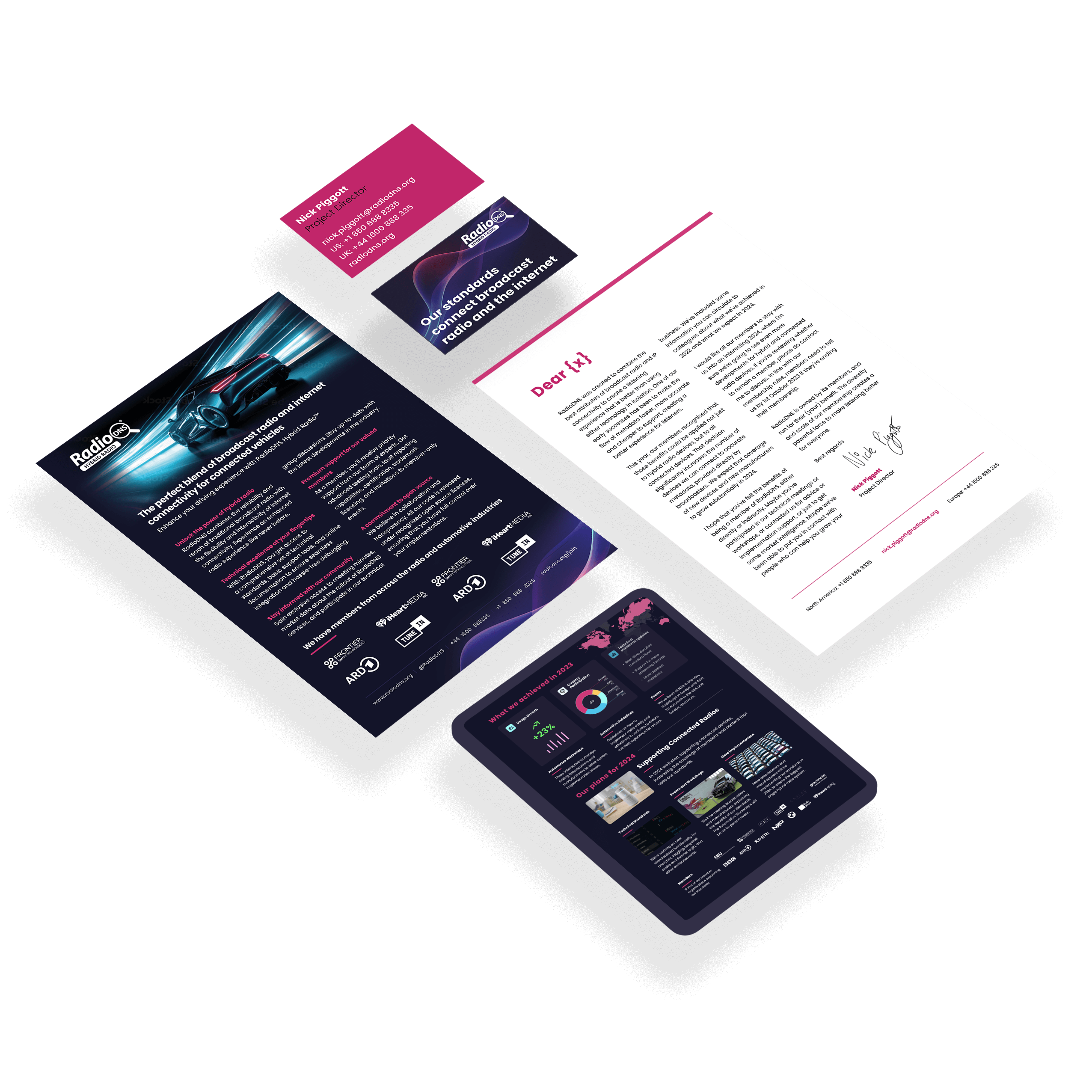
Using our print guidelines we were able to create
✅ Exhibition stands and banners
✅ Yearly membership renewal packs
✅ Beautiful business cards
✅ Informative leaflets
Is that the end? Well not for RadioDNS and I, we continue to work together on exciting projects, they're a wonderful team, dedicated to excellence and their userbase.
FYI, I worked with blackspike, who's an amazing developer . He created a fantastic custom wordpress CMS for the team to quickly create events, news and blog posts. Thanks for the great teamwork, blackspike! ♥️
Stay updated
Sign up for my studio newsletter for all the tricks of the trade, inspo and offerings
All services
Website design
Iconography
Website review and suggestions
Social asset creation
Brand/site refresh
Logo Design
Product packaging
Business cards & printed design
Brand guidelines
Presentations and slide decks
Interface design
UX research & design
Wireframing and prototyping
Accessibility design
Design System creation
Something you want that's not on the list?
Send me an email and we can chat through your requirements
Selected Works